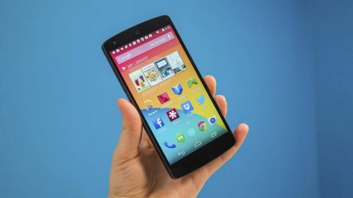
Google has finally kept on their promise on creating a user-friendly interface that will be everywhere. Sort of like Window 8 and how it works on phones, tablets, laptops, desktops, etc, the Android “L” will be on every device.
The new UI design will have simplified shapes and smooth transition animations across the UI. Rather than just closing an app, it’ll actually just shift into the next app. The new stack adds an illusion of depth and adds drop shadows to each app.

The notification menu is now sorted by relevance and importance, not chronologically. So that urgent text from your wife to grab her milk on the way home will be on top of the stupid ad that popped up because you’re using a free task manager app. Another really cool thing is that now phone calls will pop up on the top of the screen. So while the director, Dave Burke, was playing a game, he couple completely ignore the call or tap the options to accept or dismiss the call. No more losing your high score in Temple Run because your insane ex-boyfriend keeps calling you telling you he misses you! Sounds like a good deal to me!
You can read up on more information about Andriod L at engadget.com! What do you guys think about it? Tell us down in the comments below!

